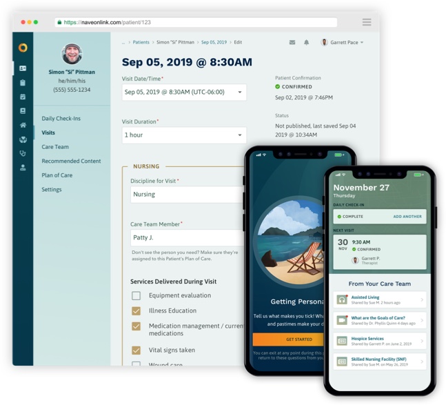

The post-acute care environment can be a challenging one to navigate for patients, families, and Care Teams.
For Care Teams, communicating conditions clearly and recommending treatments is already difficult, and in palliative care—where the goal is to comfort the patient rather than provide curative or preventative treatment—this is even more challenging.
For patients and families, understanding the significance of a decision can be murky. They often lack the context to see ripple effects, or they get lost in endless medical jargon. For loved ones making decisions on an incapacitated patient’s behalf, it can be a struggle to weigh the patient’s desires against their own.
Naveon, a leading healthcare technology company, wanted to incorporate lessons learned from their intensive care unit apps and brainstorm new ways of enhancing doctor/patient communication.
They understood the medical, emotional, and spiritual crises that can occur when someone is seriously ill, and that the best decisions are made when patients, families, and Care Teams forge meaningful, personal connections to each other. Research shows that improved communication leads to a reduction in unwanted care and higher satisfaction for patients.
They needed an app to:
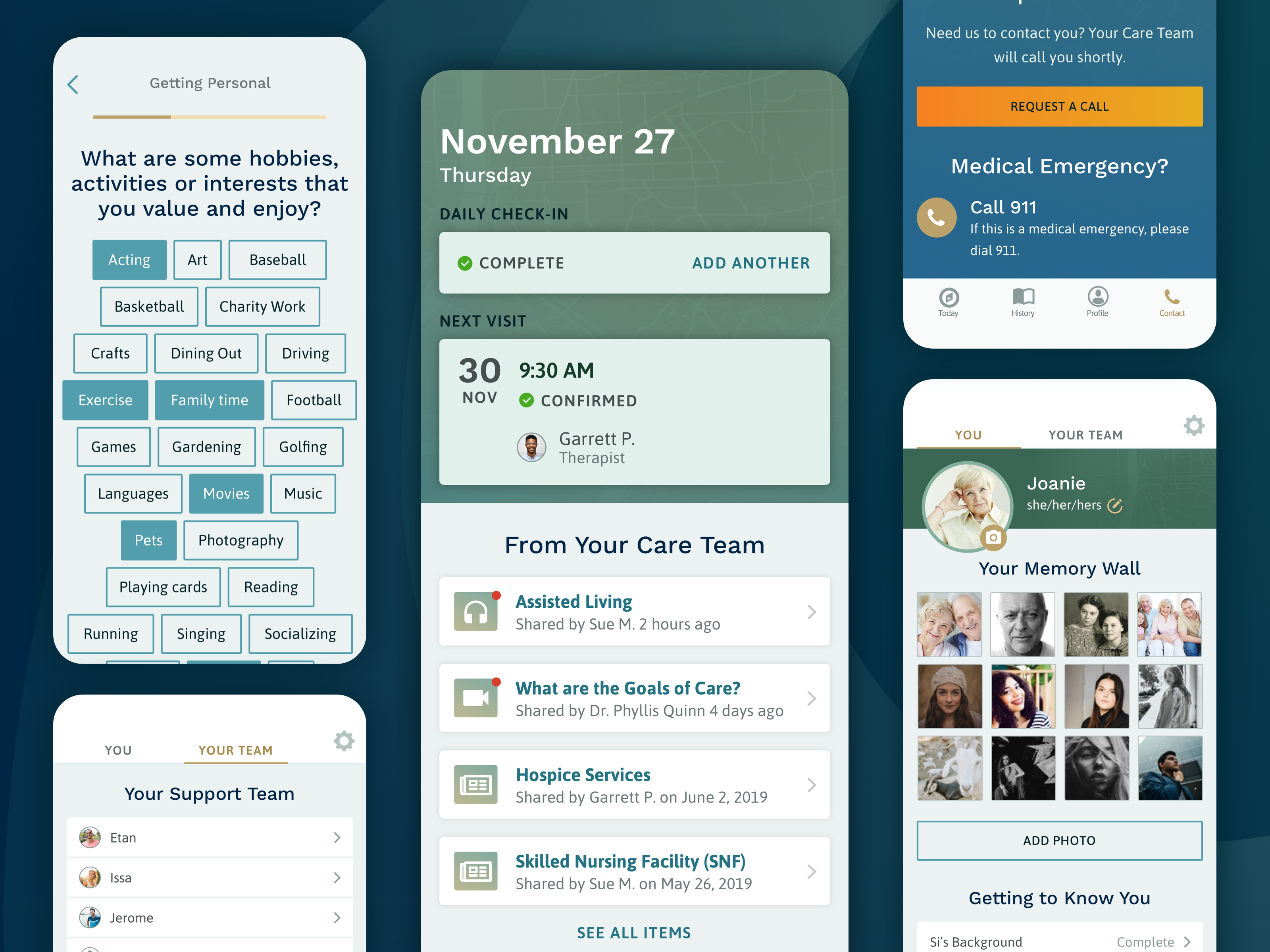
As the sole designer on such a large cross-platform project, I led the design process from start to finish on NewAperio’s small, highly-collaborative, cross-disciplinary team and worked directly with their customer, Naveon.
Before engaging us, Naveon had already launched a similar mobile and web application to manage content for patients in intensive care units. Naveon wanted to incorporate lessons learned in the ICU and brainstorm new ways of enhancing doctor/patient communication in the new post-acute context.
Though Naveon’s team had already developed content and knew the key to success laid in building close connections between Care Teams and their patients, they weren’t entirely sure where to make changes or how to improve their current model.
My work with the Naveon team revealed that while the content they created supported and educated patients, it fell short in creating a system Care Teams could use to “treat the whole person.” We needed to design an engaging experience and prompt patients, families, and Care Teams to consider how a patient’s values, beliefs, and preferences can inform decision making about healthcare.
With NewAperio’s Founder & CEO, I led a Product Design Sprint—a five-phase process (modeled after the process defined by Google Ventures) that uses design thinking to brainstorm and prototype innovative solutions and test them with real customers.
I partnered with my client (NewAperio) and their customer (Naveon) to uncover assumptions, identify complexities, gather and clarify requirements, and write user stories. I worked closely with developers to vet technical feasibility and create a shared understanding of the problems we needed to solve.
Following a heuristic evaluation, I created the concept of “Get To Know Me”, which became the central feature of the application. I devised information architecture for the complex administrative back end used by Care Teams to manage content, as well as the intuitive user-facing mobile application.
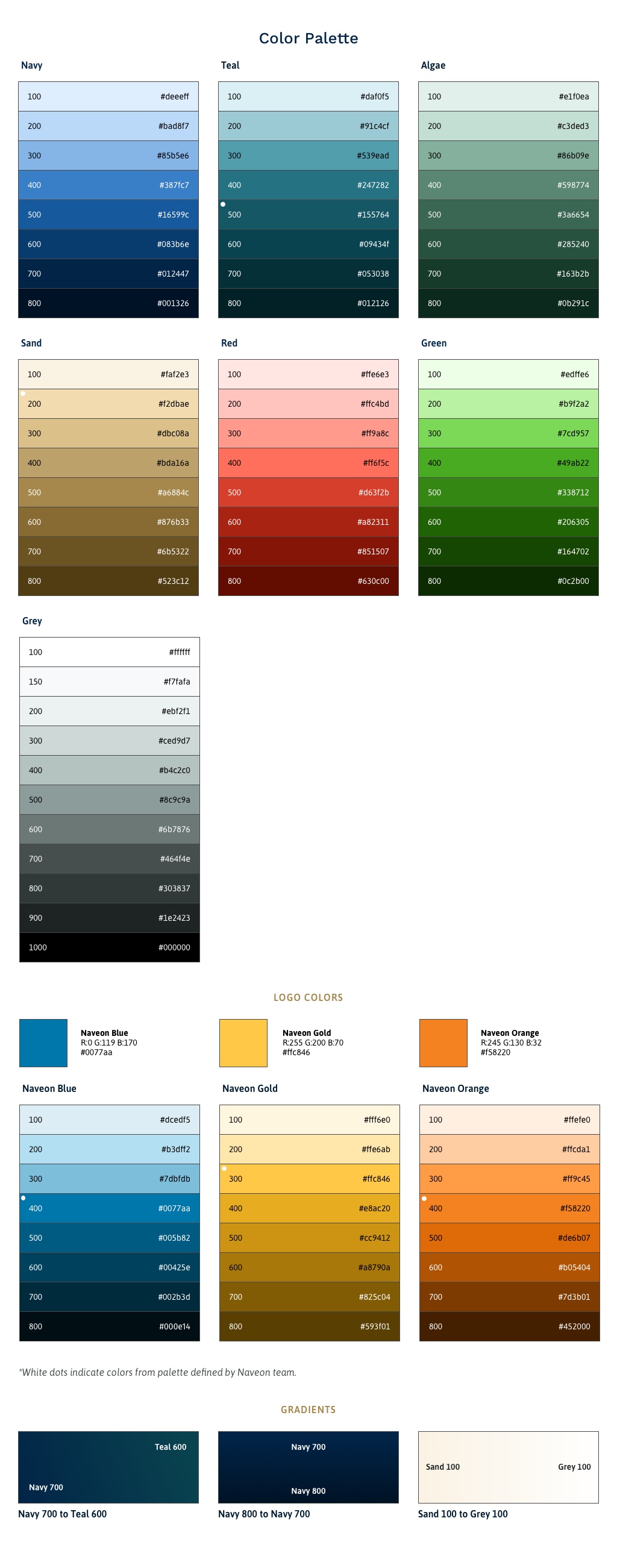
I shifted Naveon’s color palette to increase accessibility while maintaining the established brand. I created a visual vocabulary and design system for use across platforms with visual flourishes and custom illustrations that reinforce Naveon’s brand messaging around guidance and support.
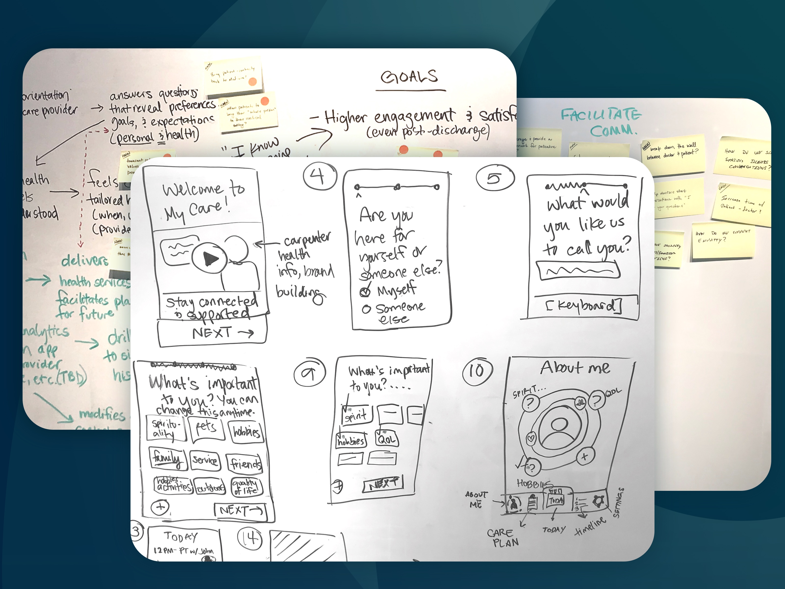
Following the framework outlined by Google Ventures’ Sprint: Solve Big Problems and Test New Ideas in Just Five Days , we mapped the problem, sketched detailed solutions, identified our primary goal, created a prototype, then interviewed and tested with users in just five days.
The design sprint process...was among the best I have encountered in my 35+ year career. The well-defined structure imposed a discipline on the process that amplified both the productivity and creativity, where frequently the focus on one occurs at the expense of the other. The testing of our design output that followed yielded real insight and we walked away from the process with solid concepts and a framework for moving forward. It also made it even clearer that this was a team of individuals with whom we wanted to work.
For the design sprint, we focused on creating higher engagement and satisfaction for patients and their families (even after discharge), while making it easier for Care Teams to deliver high-quality care.
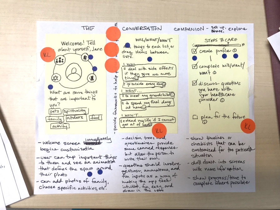
In early sketches, I conceptualized how we might gather information like values, beliefs, hobbies, and other personal characteristics about the Patient. The experience should draw the user in with highly interactive inputs and flows centered around sharing and exploring. Still, we needed to gently guide patients and their loved ones to help them zero in on when and how to make decisions about their care, supported by educational resources and a close relationship to their Care Team.
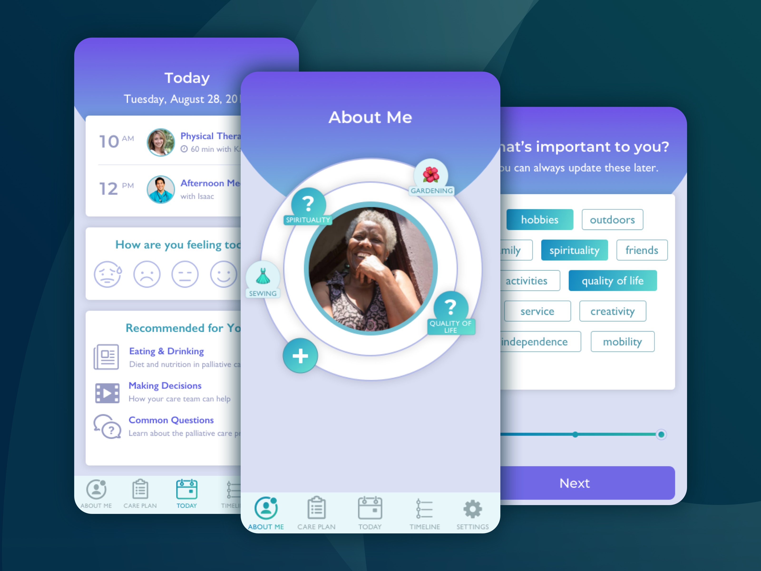
For the prototype we tested, we included a “nucleus”-like design that allowed users to define what was important to them, assign it an emoji, and put things more dear to them closer to the center of the circle design. In our user testing sessions, we found that while the concept of a personal profile as a way to connect with Care Teams resonated deeply, the idea and design of the “nucleus” interface wasn’t intuitive enough.
With valuable feedback gathered from users during the design sprint, we knew we needed to pivot and expand our approach for onboarding patients with a rich questionnaire and profile builder in the mobile app.
We needed a way to solicit specific personal information from patients and their families without making them feel they were filling out long, dense health forms at the doctor’s office. How could we ask them questions that prompted personal reflection and felt engaging and fun? How might the mobile app kick-start a warm experience getting to know their Care Team?
I looked to dating apps for inspiration, as they often have long onboarding processes or profile builders with dozens of personal questions, yet feel fun and engaging rather than something arduous to skip over. Users feel engaged, open up about themselves, and can revisit or tweak their profile over time.
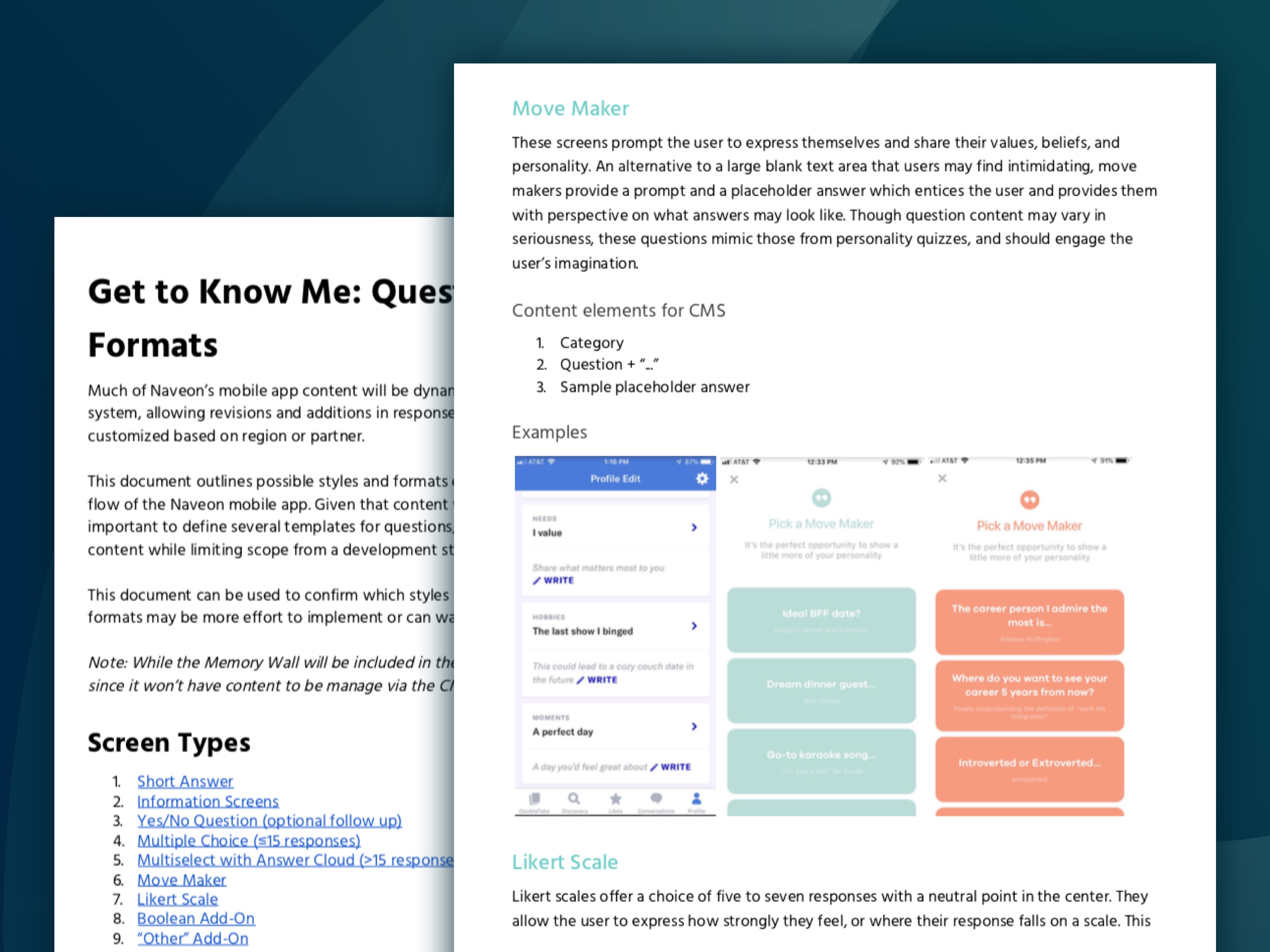
With a heuristic evaluation of half a dozen dating apps in hand, I shared the inspiration with Naveon, and they loved the idea.
Our team faced the challenge of creating a system that allowed Care Teams to specify custom "Get To Know Me" questions and flows depending on a patient’s diagnosis, all editable as part of a content management system accessible on the web.
Together with Naveon we defined a limited number of question types to keep scope manageable for development and ensure that questions could be created and customized in the content management system.
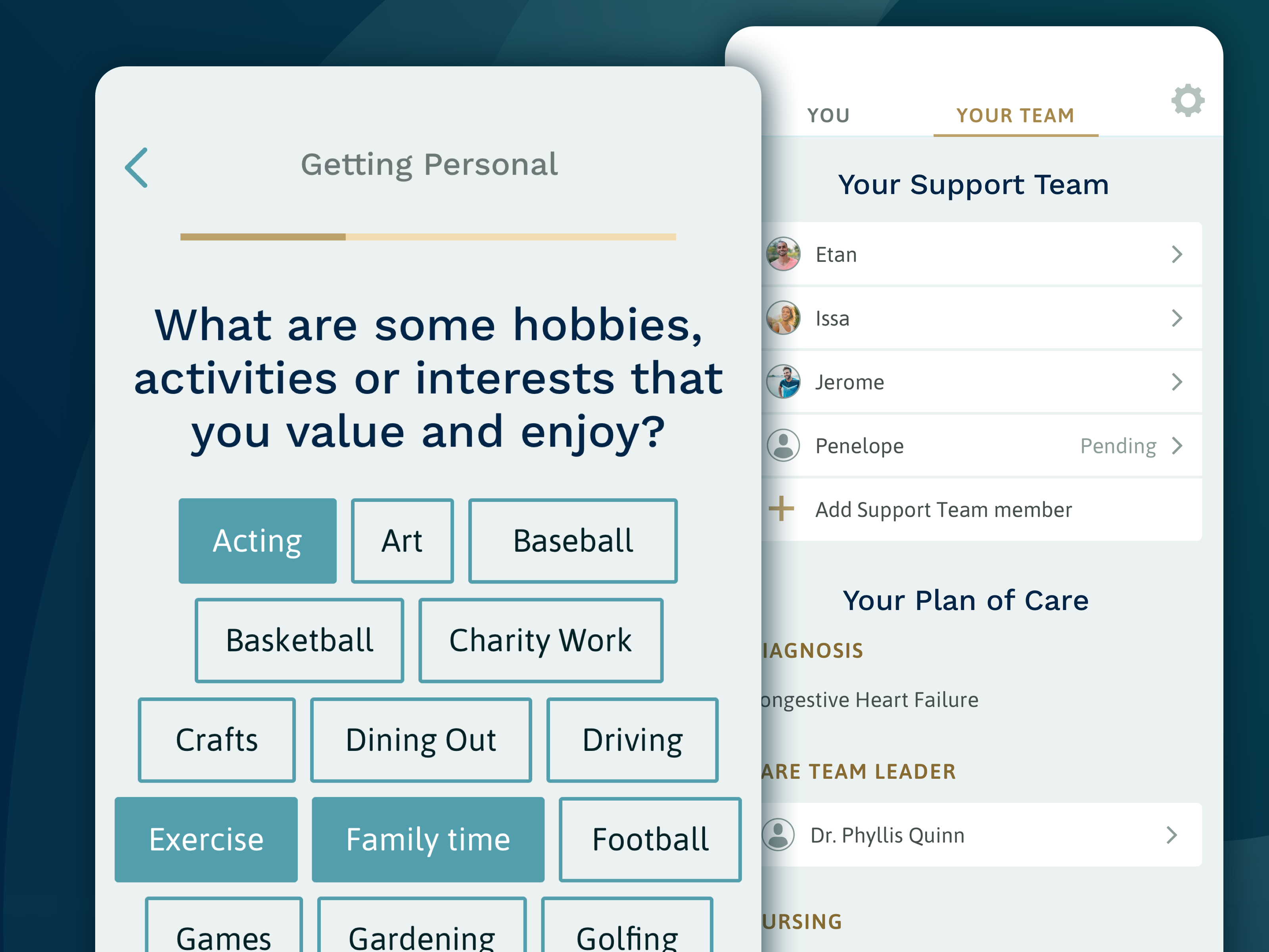
With question types defined and interactive screens designed, I proposed developing a unique and flexible illustration style that can evolve as Naveon grows—something visually appealing that works in many contexts and across character, scene, spot, and icon illustrations.
I was tasked with creating a collection of vibrant, whimsical, informal illustrations that could be used to break up sections of questions. Because "Get To Know Me" questions may vary by a patient’s diagnosis or care facility, I could not anticipate what content or question an illustration might be paired with.

To create a broad and flexible system, I identified unified concepts, themes, motifs, and visual styles that communicate Naveon’s brand while taking into account the user’s emotional state. I wanted illustrations and visual style—like the app itself—to guide and support the patient’s experience. I focused on illustrations that depict journeys, guidance, and peaceful or expansive landscapes.
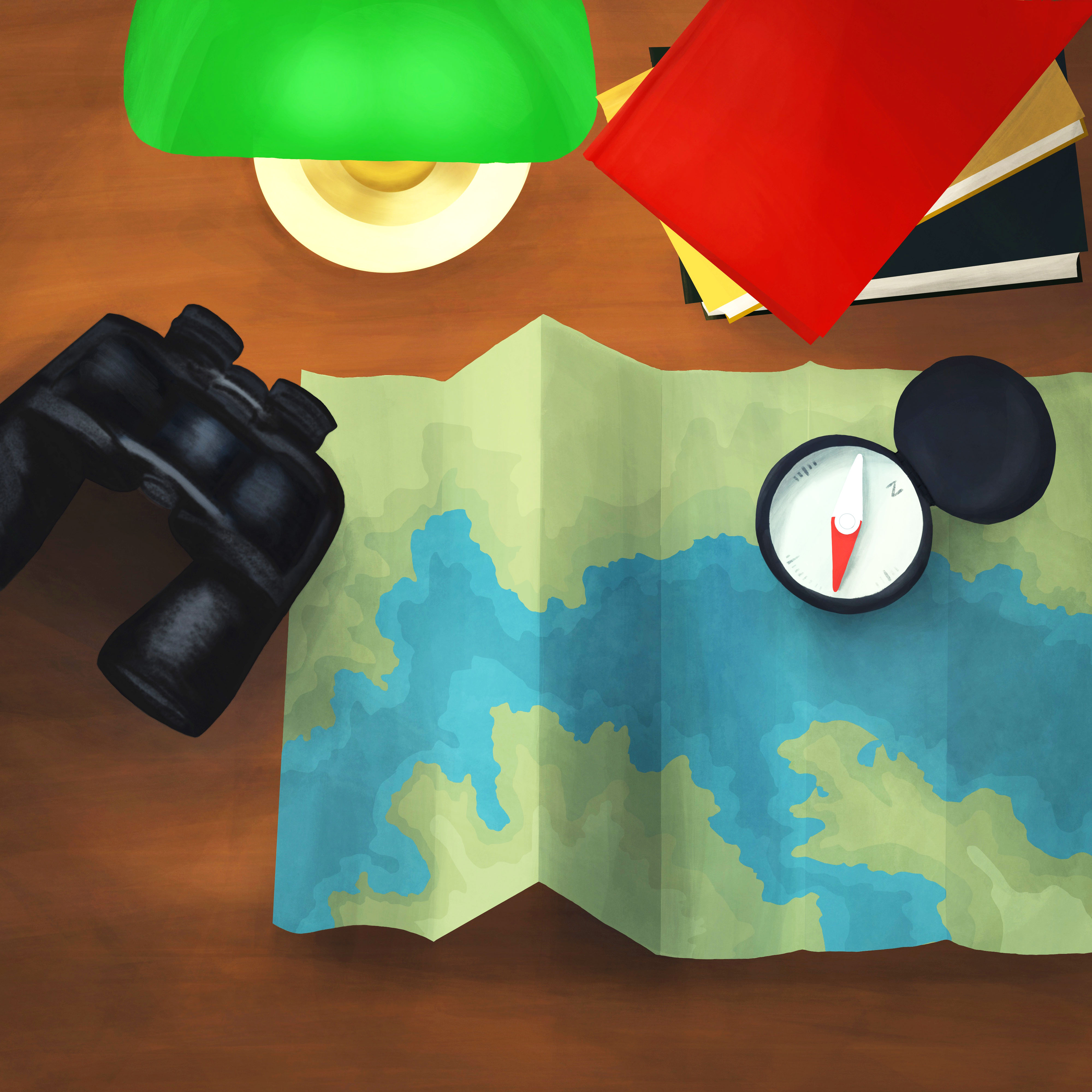
Some of the emotional themes I identified were in direct contrast to situations the patient or their families find themselves in—a contrast to emotions we typically associate with post-acute care. Visuals and interactive design in the app seek to soothe and support, rather than amplify the stress and confusion that can often accompany medical events.
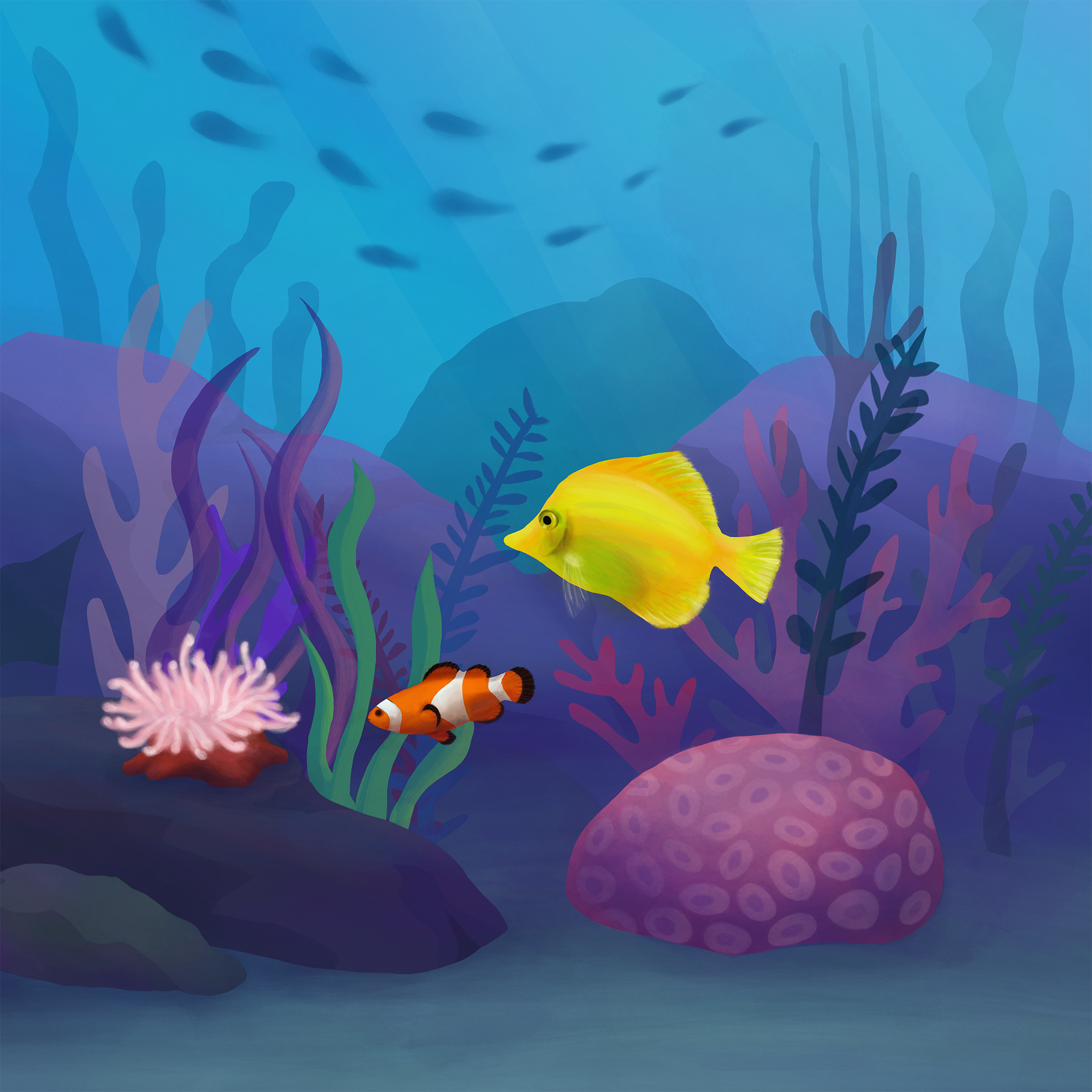
At the same time, it was important that illustrations and visuals strive for balance. Scenes, characters, and themes depicted shouldn’t feel insensitive, oblivious, or out of touch with the user’s situation. When using the app, users should feel:
To power the mobile application, Care Teams needed a robust content management system where they could manage staff, assign patients to Care Team members, create Plans of Care, monitor any calls or requests from patients, edit settings on a specific facility, define diagnoses, and customize what content a patient sees in their mobile app’s Content Library.
Even with the complex needs for this administrative back end and multiple user roles, Naveon wanted an intuitive experience and an easy-to-use interface that wouldn’t get in the way of providing patients with high-quality care.
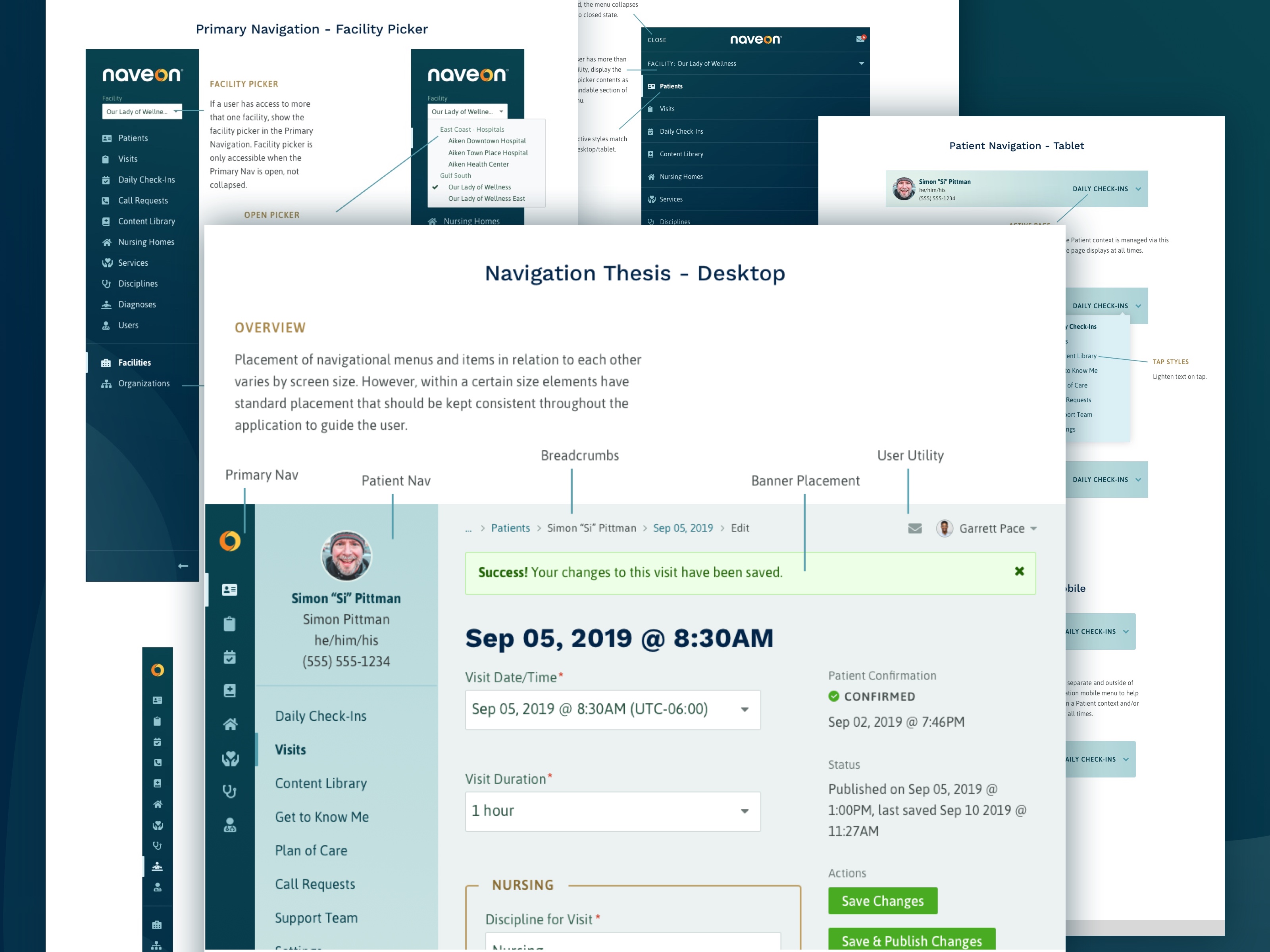
The application had to work across multiple device sizes for Care Team members. Care Team members might work across multiple care facilities with potentially hundreds of patients. I worked to define an information hierarchy and navigational structure to reflect complex relationships while making them easy to understand and navigate. I provided robust documentation around interactive states, user roles, and screen size for developers working on the project.
I provided a number of other resources to aid developers like extended, accessible color palettes that provide adequate contrast, even for low vision users.
I also used construction of the style guide to vet components for use across platforms: on the darker gradient backgrounds of onboarding and "Get To Know Me" screens in the mobile app or on light backgrounds in the web application. By vetting design of components early, I ensured the mobile and web applications could share visual vocabulary despite these differences.
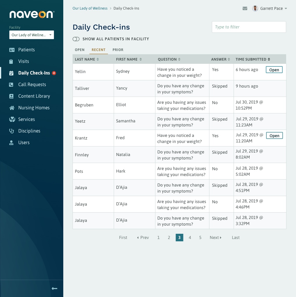
Care Team members needed a high density of data to accomplish their tasks in the web application, but I didn’t want them to feel overwhelmed. I kept visual elements minimal to make it easy to focus on content and tasks. The end result: the interface feels on-brand and in relationship with the mobile application, but the design doesn’t get in the user’s way.
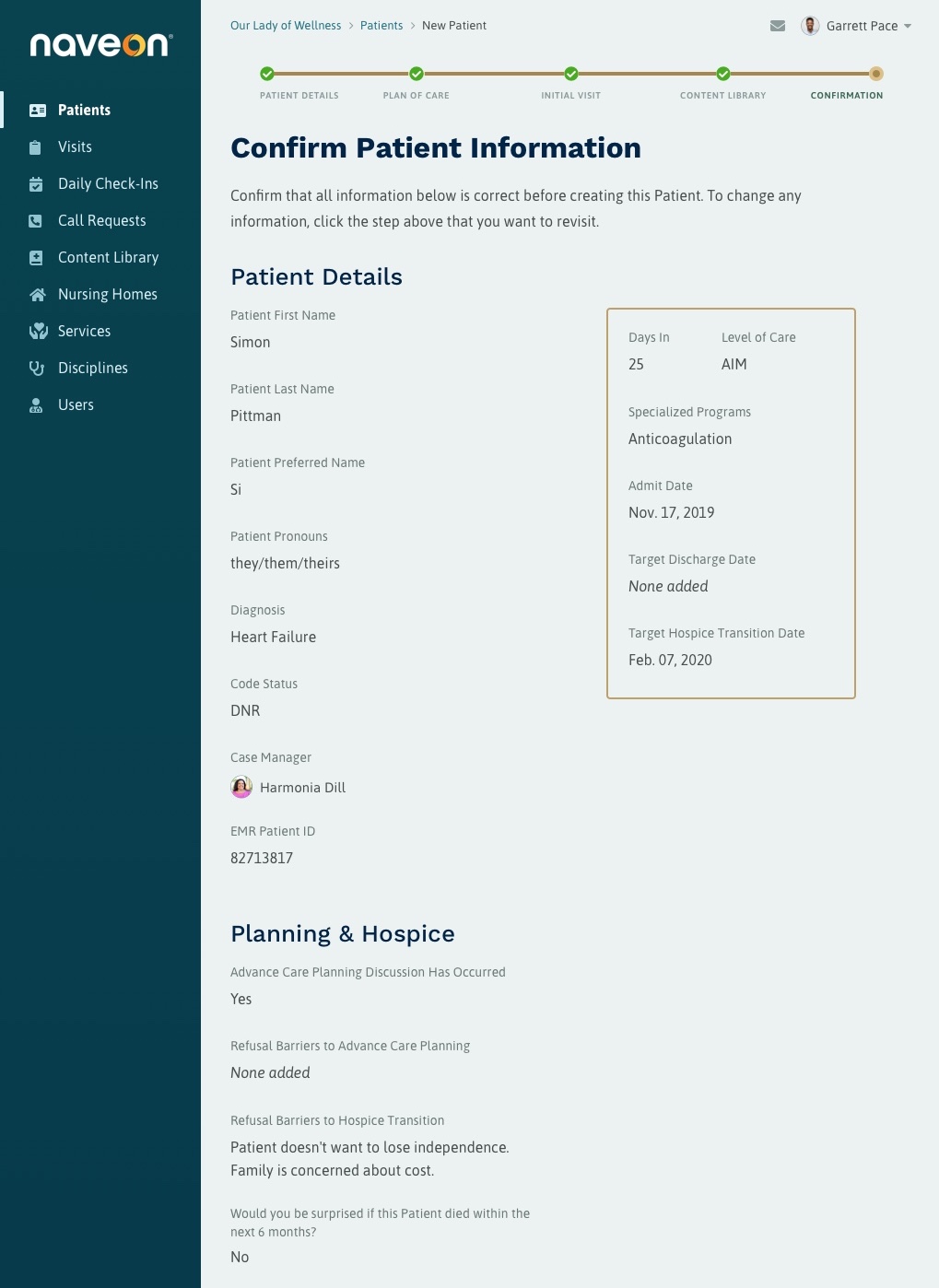
Where possible, long tasks and user flows were broken down into multi-step wizards so Care Team members could focus on the discrete task at hand or return to it at a later time.
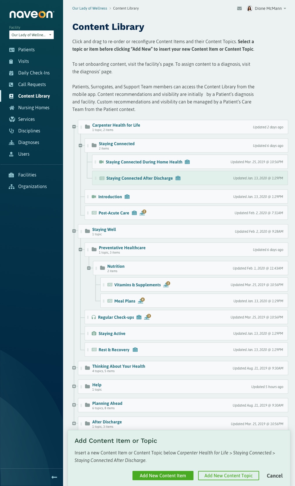
Highly interactive interface designs incorporate drag and drop to navigate complex content hierarchies or file trees so the user can control how much data they see without missing any details.